Daniel Feusse
-
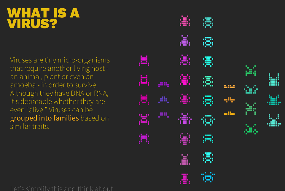
the office for creative research
Helped out with this project when I was an intern at OCR. It was built to complement research published by Columbia University on viral diversity.
-
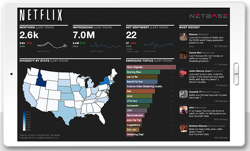
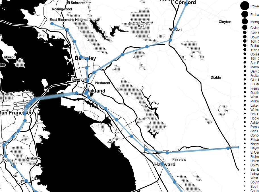
set of live dashboards video
As the sole client side engineer, built this product suite which was featured on the front page of the companies web site and has a sales team built around it.
-
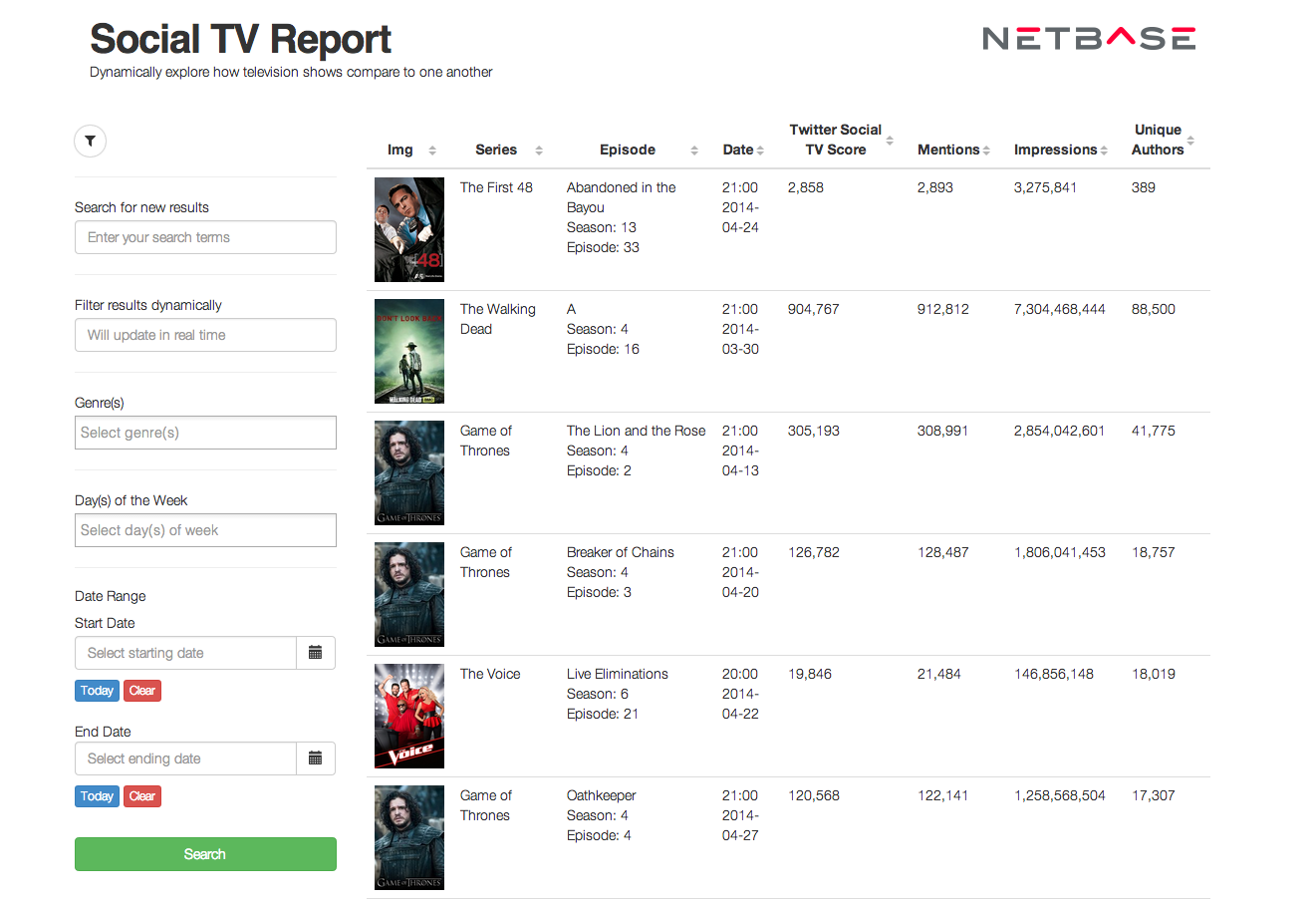
social tv ranker, video
built using angular. this is a prototype of the finished product which allowed brands to see how tv shows stack up against each other using NetBase's data
-
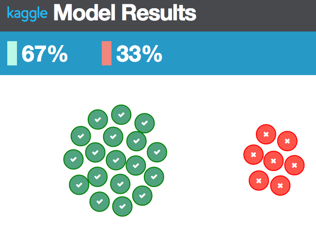
kaggle visual
Used D3.js, Angular.js and Flask to build a web app to visualize my results when doing kaggle competitions
-
-
-
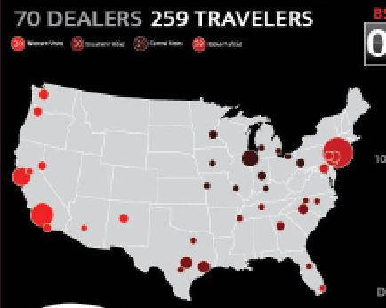
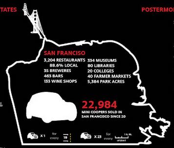
infographic for MINI dealers
I made this infographic for MINI dealers to look at and sitribute amongst themselves. It was used as a poster in the meetings.
-
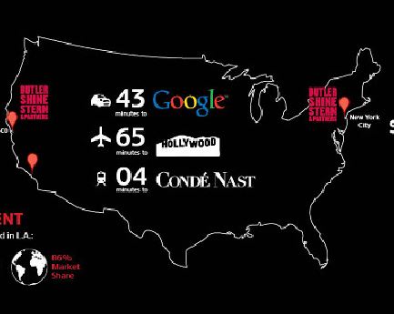
conclusion, slide one
This slide was used as the first of two slides in the conclusion of the presentation for MINI's global business.
-
conclusion, slide two
My favorite of the two slides, this was intended to show the fact that San Francisco has just as much culture as European cities. I moved to Sf for this reason, so was cool to try to visualize.
-
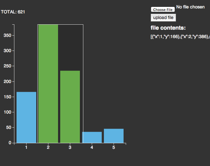
form submission using angular for custom d3
Started with a bar chart from this bl.ocks page because it's sexy, then used angular so could submit your own json data
-
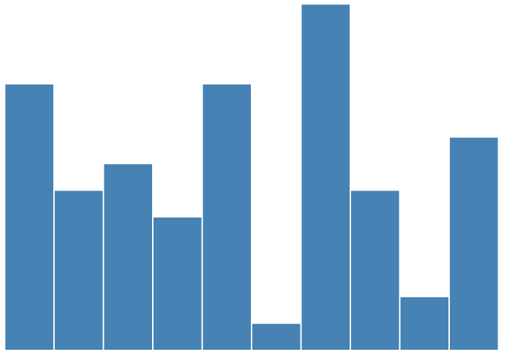
resizable d3 using angular
responsiveness is crucial for sites. used angular to build a basic chart and make it responsive
-
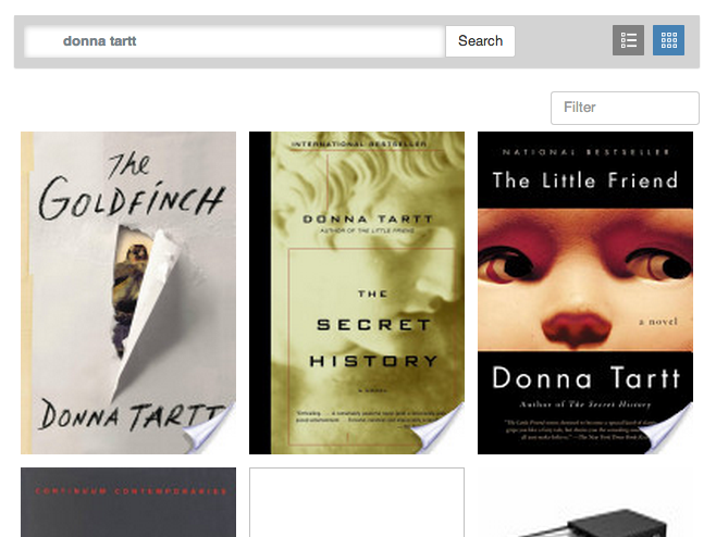
search google books api using angular
i love reading, so thought it'd be a fun exercise one night to mess around with angular and google books api
-
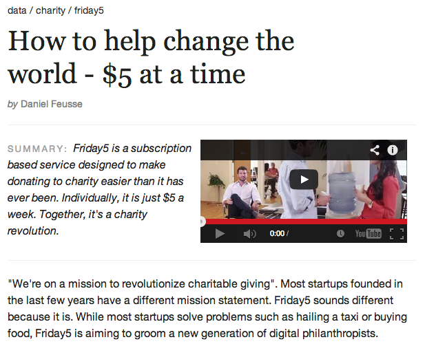
article + visual
I made this visual for Friday5.org to show users how much and where money was donated to.
-

-
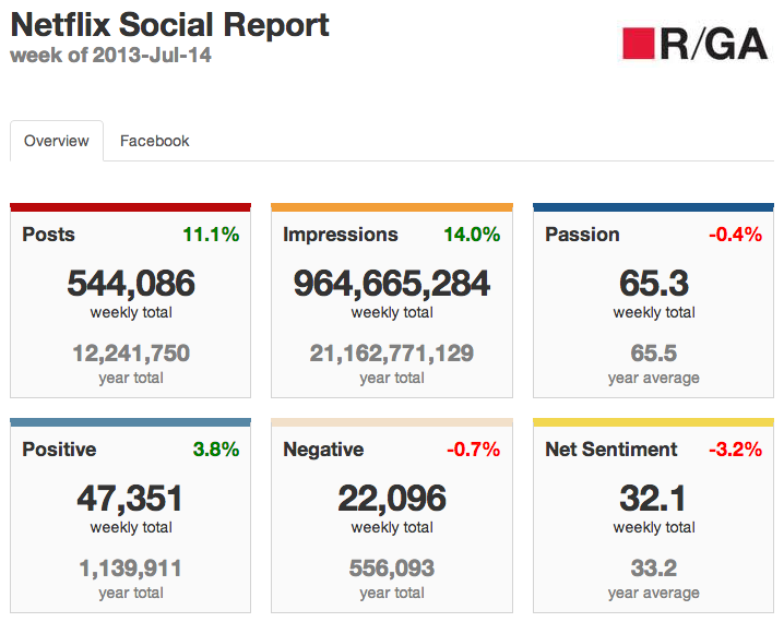
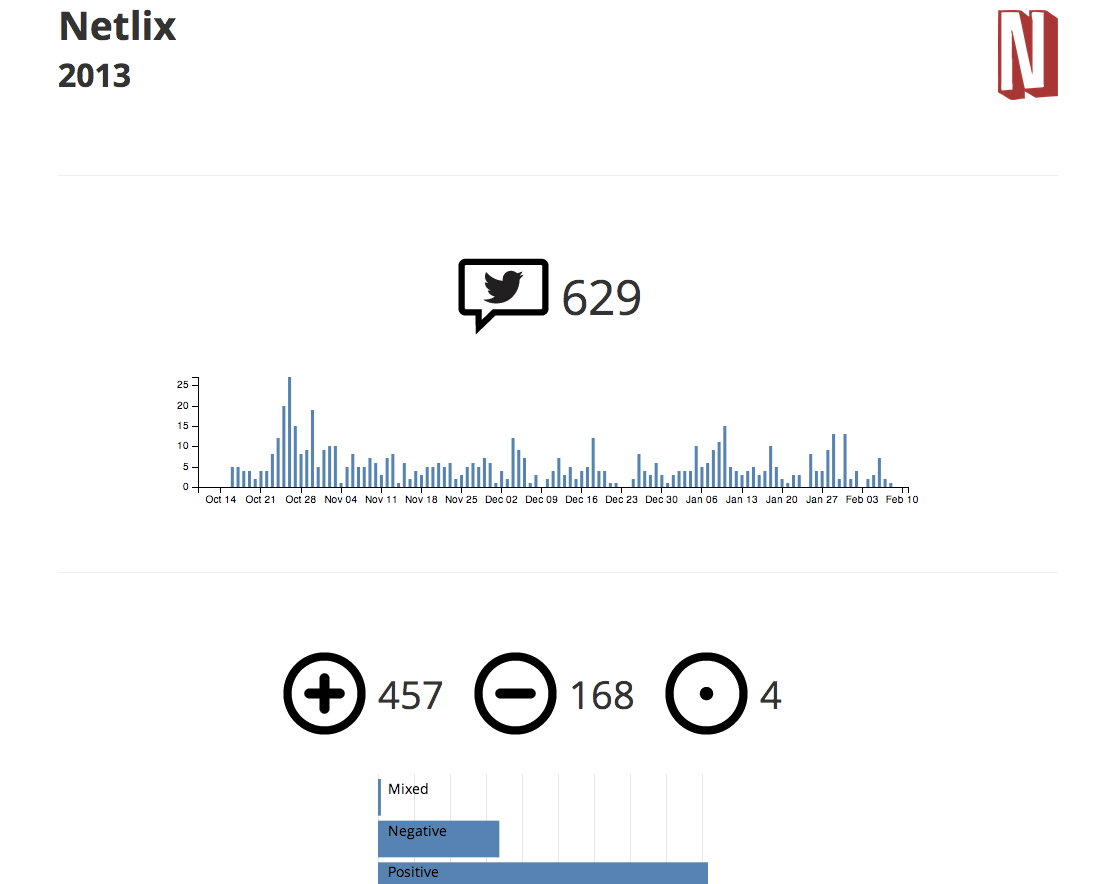
netflix dashboard
A dashboard I made for Netflix, originally pulling data using Node.js but this example is using a static json file.
-
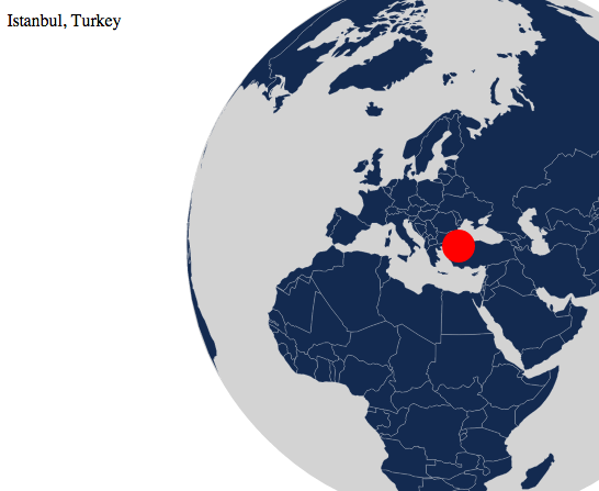
cities on a 3d globe
Derived from the world tour example by Bostock, I wanted to visualize which cities mentioned a specific brand.
-
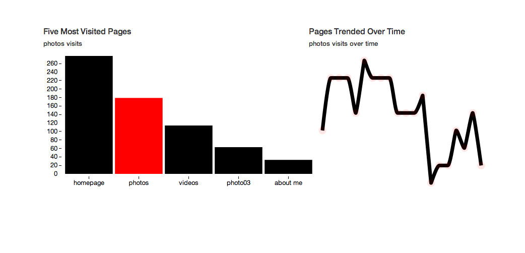
linked d3 charts
Often when comparing multiple metrics, I want to see both the total and trend over time of each. This is a simple way to link both.
-
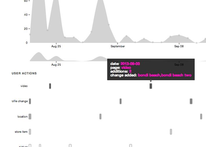
timeline with user actions
A rough prototype I put together for a companies analytics page to show an individuals total traffic as well as content added to help explain spikes in traffic.
-
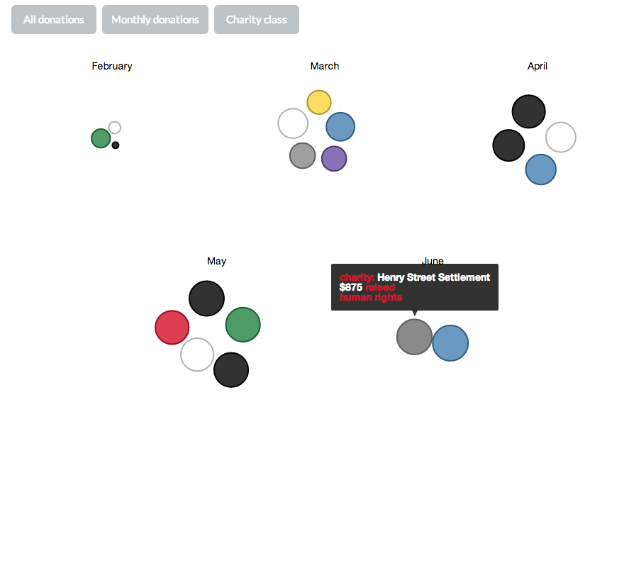
friday5 giving
I made this visual for Friday5.org to show users how much and where money was donated to.
-
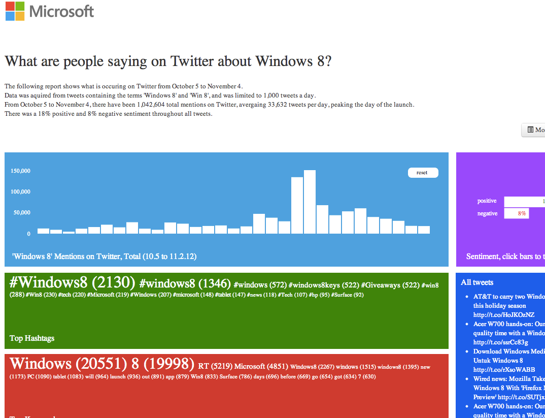
microsoft report on twitter activity
This was an interactive report showing activity on Twitter following the launch of Windows 8.
-
crossfilter
A presentation for work I did which covered using Twitter's streaming API to obtain and store tweets in a Postgres db and then trying to assign sentiment to each tweet.
-
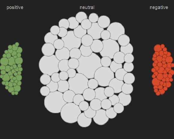
showing sentiment
I was trying to show sentiment in a different way other than just three bar charts, especially because different topics come together to make up each sentiment bin.
-

why you should learn d3
I gave this quick, five minute presentation to the Analytics department trying to show the benefits and fun of learning D3.
-

R/GA innovation project
A presentation for work I did which covered using Twitter's streaming API to obtain and store tweets in a Postgres db and then trying to assign sentiment to each tweet.
-

presentation: presenting data and information
I gave this presentation a few years ago showing how to effectively present data. Based heavily on Edward Tufte's principles.